We helps you do more creative things quicker because we have everything you need, Just simply amazing.
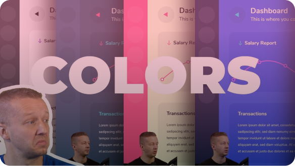
these top notch creators, founders and designers shows how they uses hexorial creative suite to improve design process and day to day workflow...
People love Hexorial Creative Suite, Check out these amazing reviews by our users and fans.
If these MVPs played basketball, they would be the MVP! (Most Valuable Player). Hexorial Studio teams know how to create beautifully crafted products for a creative audience. Amazing products by an amazing person!
-- Ryan Hayward - Pitchproof
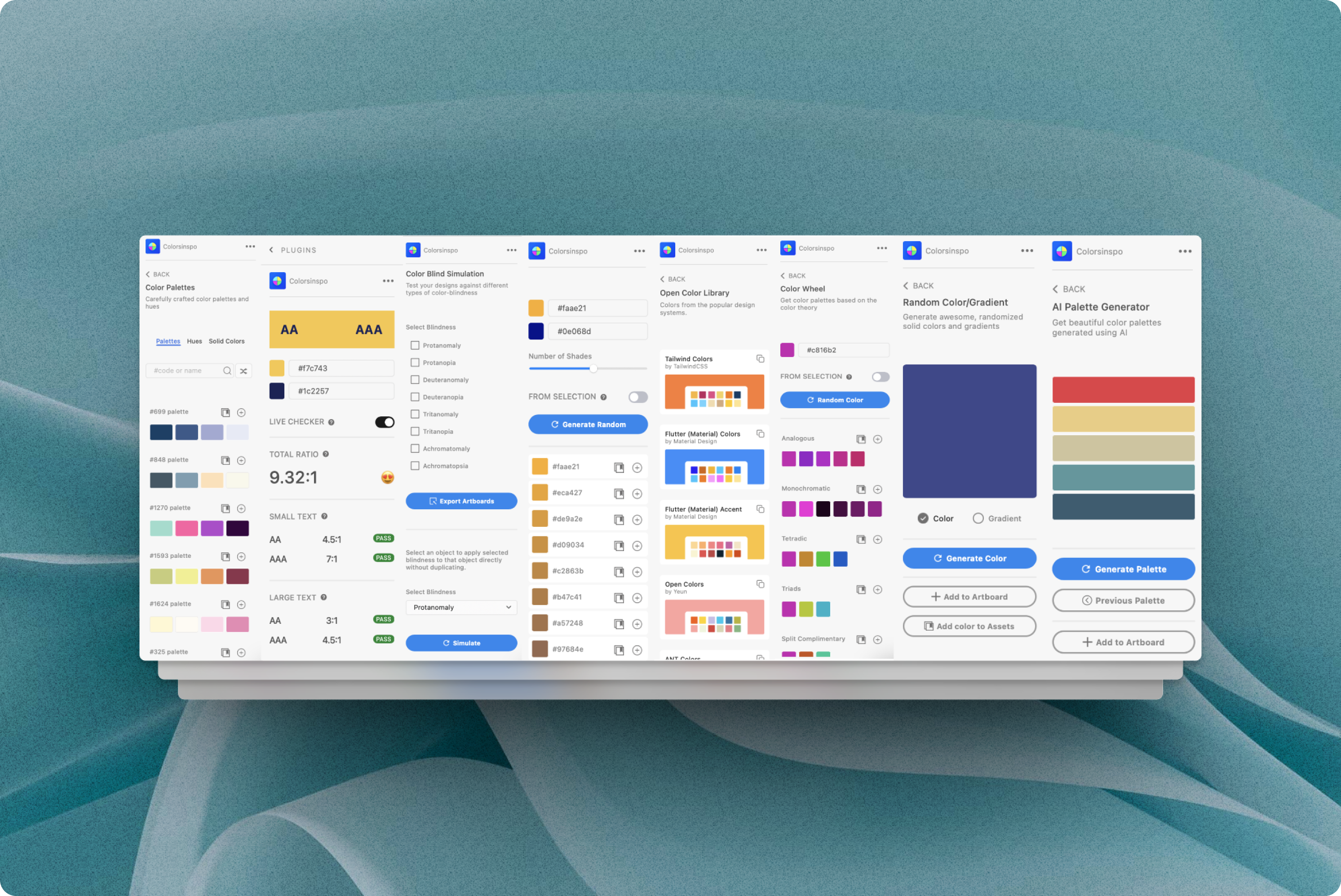
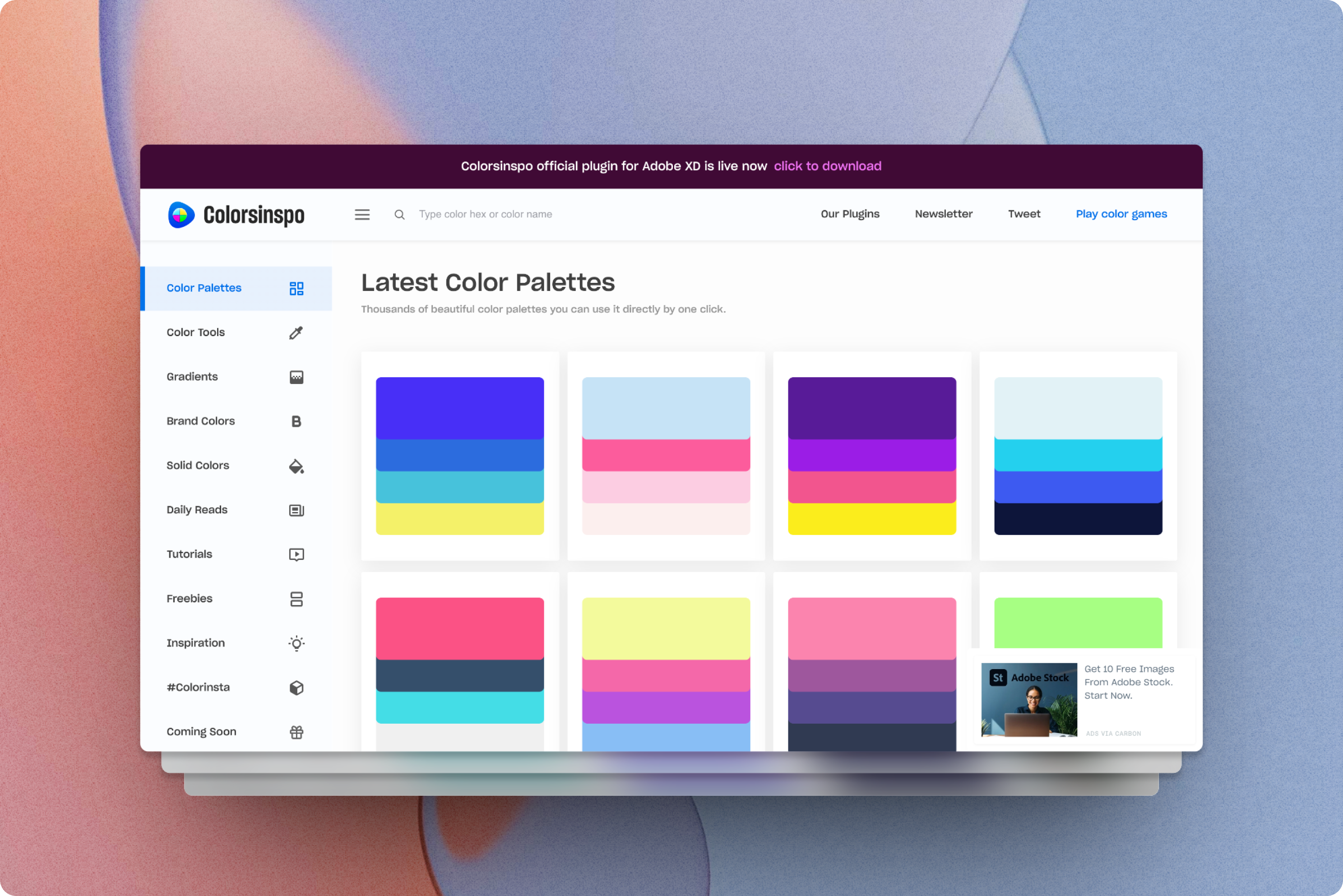
Excellent website colorsinspo. It looks great and is very user friendly. I find this tool to be especially useful because I have to design logos for one of my sites. Plenty of colors to choose from as well as other helpful color tools. Overall awesome product.
-- Lynox Byaus - Brandful.shop
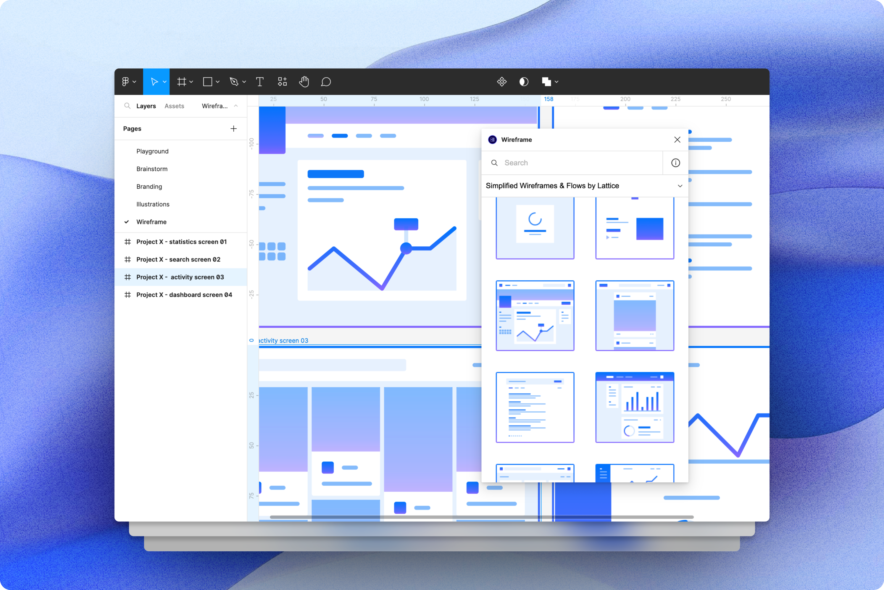
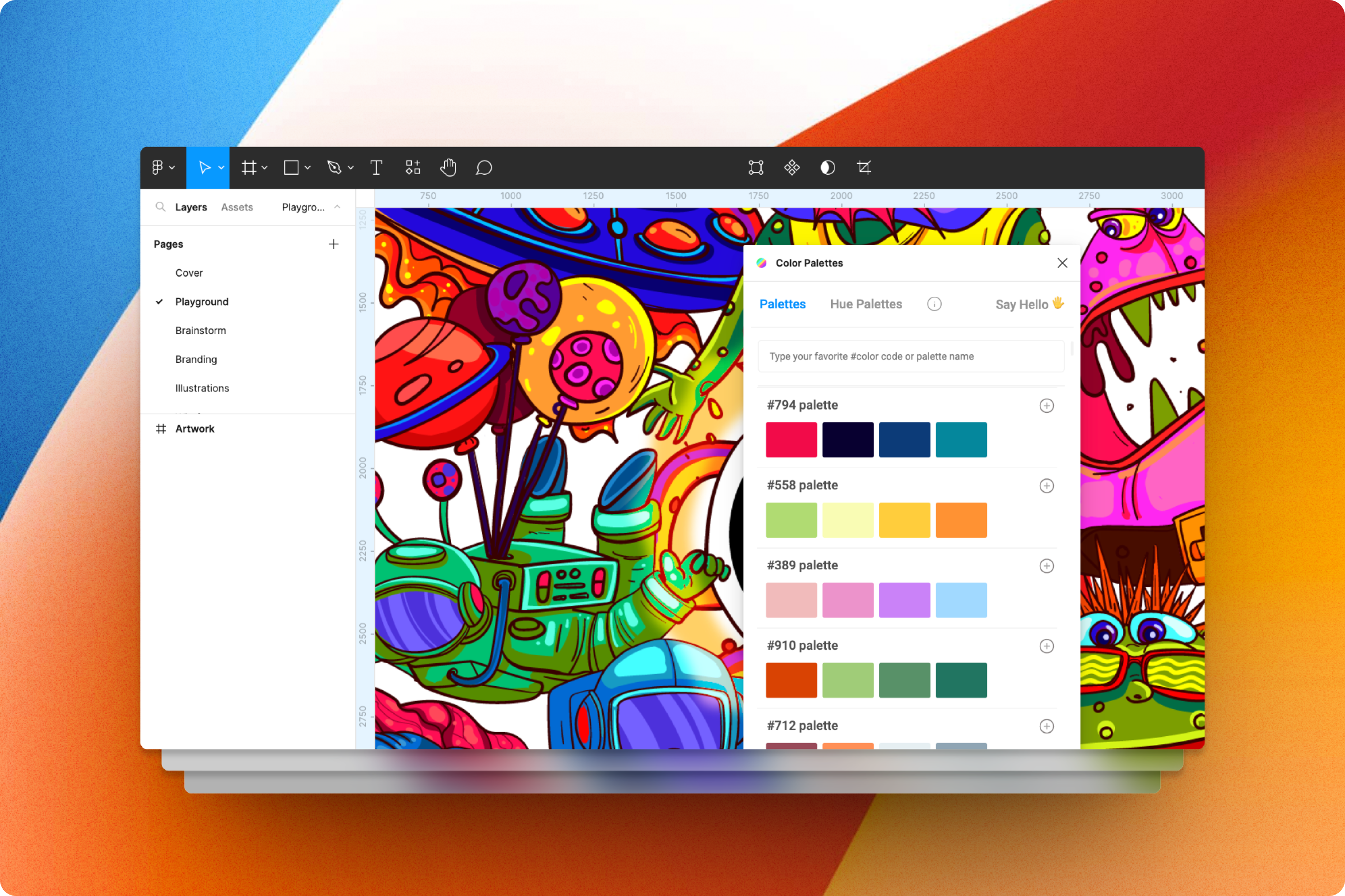
I used the wireframes plugin and it is super fun and smooth. Thanks for your contribution. I made an entire journey map within an hour with the help of the plugin with only a few edits.
-- Shantanu - UX Designer
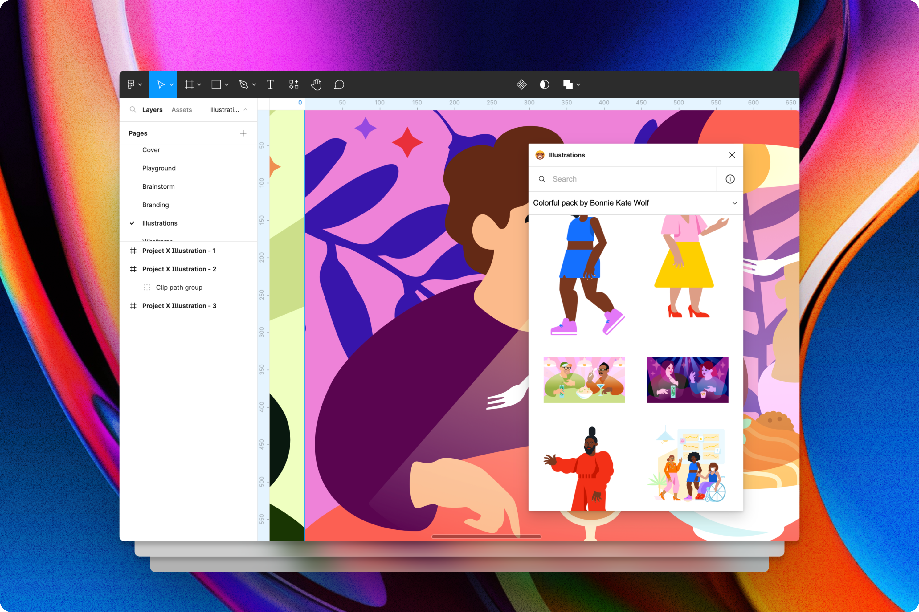
The plugins are fantastic. Very easy to use and I got everything I need to use in my day to day design life. I am completely blown away.
-- Chitan - Brand Theory Studio
I have been waiting for this launch for a while. Great set of tools. I love that you are making people smarter about color and making it easier to work with color.
-- Tela - 1brand.co
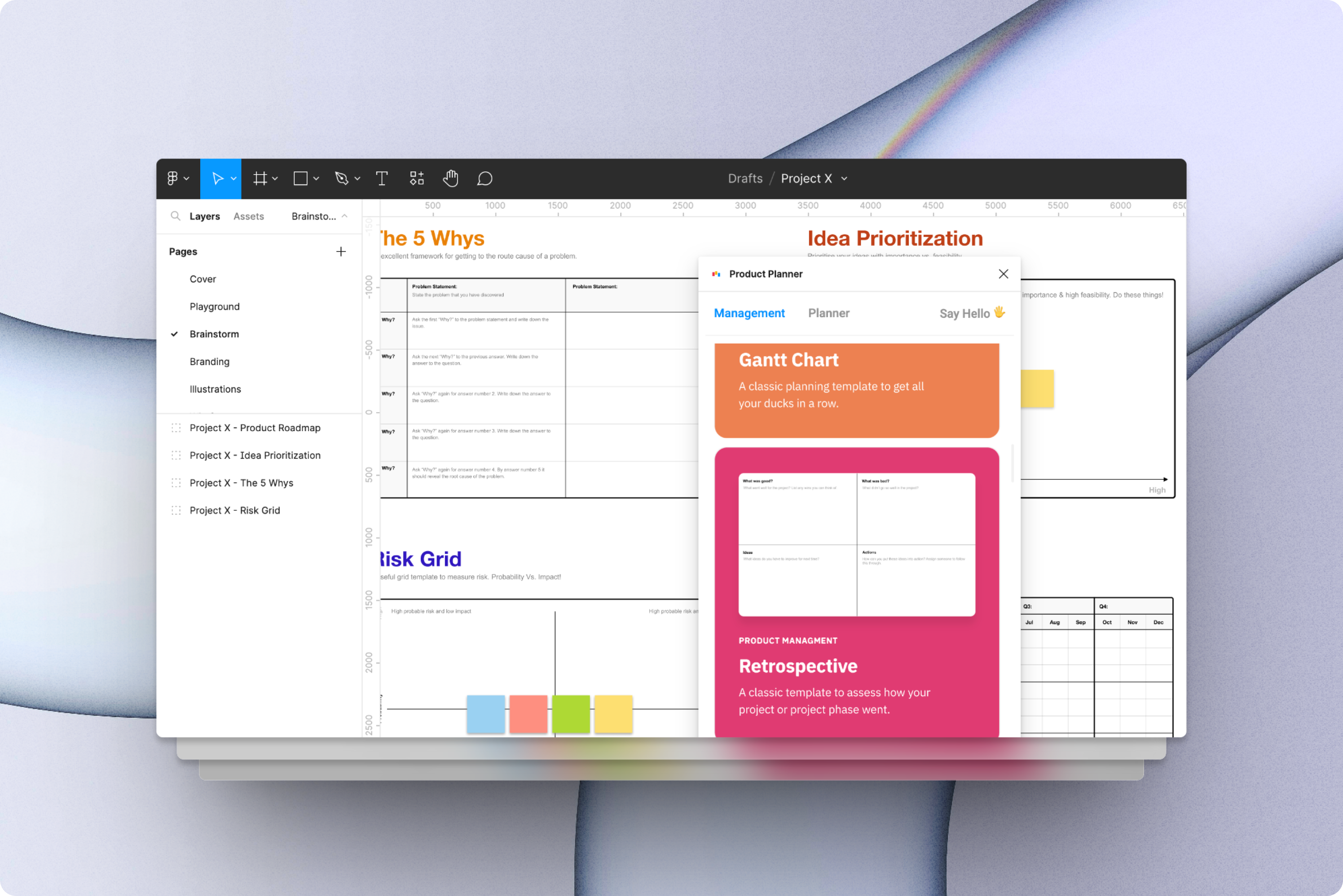
Great sets of plugins. Easy-to-use and super cool. It makes my workflow faster by 2X. Helps me a lot during my team meetings and virtual brainstorm sessions.
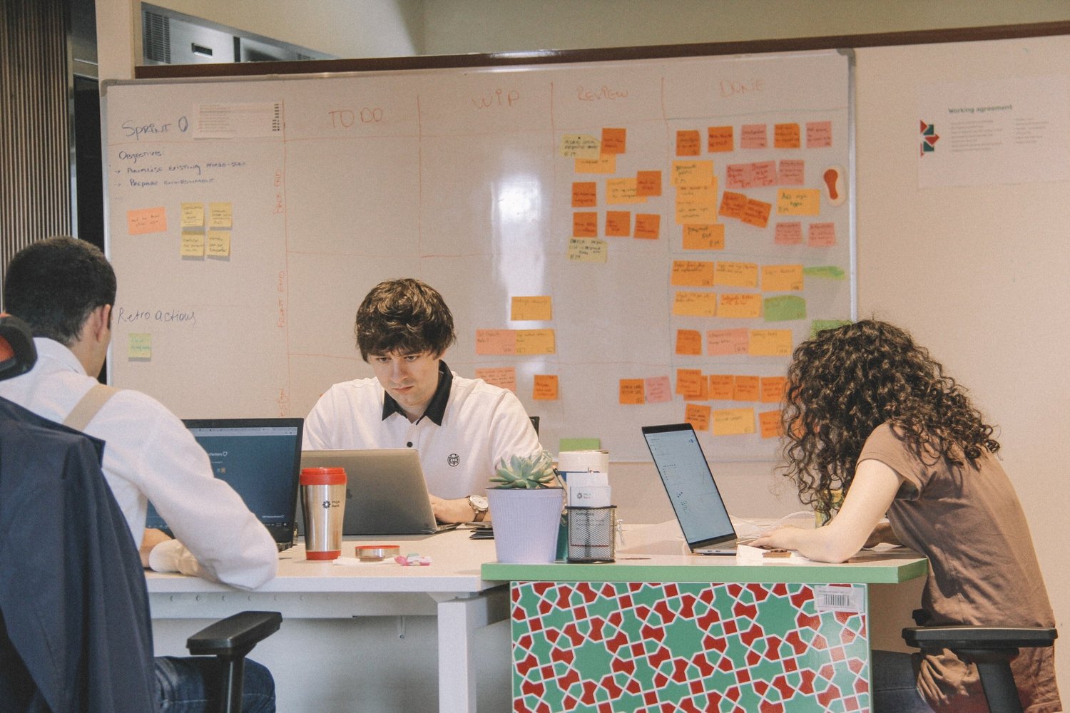
Everyone saves time, money and energy with our tools which is designed to fit the way teams really function.
Read a lively collection of essays with a range of practicality, Think of it more as a string of contemplative thoughts rather than a structured series.
It combines creative tools, plugins, design resources, and studio services built to support day-to-day product work across design, growth, and development teams.